

Visualisation#
Normally when plotting one can load the relevant variables directly, as used in a python script. When working interactively the variables will often be loaded directly, through pandas directly or from a dataframe supplied by the plotting software. Interactive working favours short commands as used with Seaborn or Altair.
Common Working#
When using plotting applications the x and y components are part of a list, array or dataframe, so the individual variables no longer refer to a single value, but several values in a sequence. Normal mathematical operations cause no problem, but special operations require numpy equivalents rather than the math equivalents, such as np.exp or np.power (not math.exp or math.pow), otherwise python raises "TypeError: only size-1 arrays can be converted to Python scalars":
....
T = np.linspace(0, 30, 31)
tau = 1 - (273.15 + T)/647.096
expo = (-7.85951783*tau+1.84408259*np.power(tau,1.5) ...
Large and Small Numbers#
When using large and small numbers, rather than write out the number explicitly it is useful to have a shorthand method. In this and most scientific papers they may have a number like -0.00013936956, if the number is much smaller it is normally written like -1.3936956 x \(10^{-6}\), which avoids having to use a large number of zeros before the significant numbers. Written in python it is -1.3936956e-06 or -1.3936956e-6 (the former is favoured), which written out is -0.0000013936956 (five zeros between the decimal point and the first significant figure). Very large numbers are tackled in the same way using positive exponents. So -1.3936956 x \(10^{6}\) would be written as -1.3936956e06 written out as -1393695.6 .
It is usual to have a number between 0 and just below 10 to show the significant figures. So 1002.0 x \(10^{-6}\) kg/ms for viscosity is a special case used because the plot was constrained to show between 0 and 1800. The SI unit for dynamic viscosity is the Pa.s (Pascal second) or Ns/m² (Newton second per square metre) or in our case kg/ms.
Working with Seaborn#
Different IDEs have differing properties when working interactively, multiple lines of code can be loaded when using Thonny and or running python from the OS, whereas Idle and pyscripter object to multiple lines of code. One can create an object/variable then see its value by simply typing in its variable name, whereas in a script one must use print(). Jupyter allows us to observe a graphical plot without typing plt.show() for matplotlib or seaborn.
Hint
Loading Jupyter Notebook
Open an OS command window, change the directory to a user owned folder, start Jupyter with the command:
jupyter notebook
this starts an html server, go to the opening page and click on the drop down menu in the combobox <New> and select <Python 3 (ipykernel)>.
Working with Altair#
Altair favours interactive working and saving in various formats, including html which allows the interactivity to be shown in web sites. Later versions work on both jupyter lab and jupyter notebook. Open at the OS command (cmd) start Jupyter with the command:
jupyter lab
This should open jupyter, either the console is directly opened in the default web browser where one can work directly with pandas and altair, or else there is a choice of
Notebook
Console
- Other
Terminal, Text File, Markdown File, Show Contextual Help
Select the Notebook Python 3 (ipykernel), if there is no choice press the
tab with +. Run your code:
import altair as alt
import numpy as np
import pandas as pd

x = np.arange(100)
source = pd.DataFrame({
    'x': x,
    'f(x)': np.sin(x / 5)
})

alt.Chart(source).mark_line().encode(
    x='x',
    y='f(x)'
)
The code should run and after a slight delay display in the same tab.
Note
If all is well
The chart does not require a name, nor does it require an instruction such as chart.show()
Many options in the Jupyter lab and notebook remain unobtainable, so do not raise your hopes on a better user experience for the foreseeable future.
Encoding Data Types#
Data Type
Shorthand Code
Description
quantitative
Q
a continuous real-valued quantity
ordinal
O
a discrete ordered quantity
nominal
N
a discrete unordered category
temporal
T
a time or date value
geojson
G
a geographic shape
The following two snippets are equivalent:
....
alt.Chart(cars).mark_point().encode(
    x='Acceleration:Q',
    y='Miles_per_Gallon:Q',
    color='Origin:N'
)
.....
....
alt.Chart(cars).mark_point().encode(
    alt.X('Acceleration', type='quantitative'),
    alt.Y('Miles_per_Gallon', type='quantitative'),
    alt.Color('Origin', type='nominal')
)
....
When working with Pandas or the vega_database, altair detects the type automatically, all other DataFrames require type to be declared. So the following are equivalent:
import altair as alt
import pandas as pd

data = pd.DataFrame({'x': ['A', 'B', 'C', 'D', 'E'],
                     'y': [5, 3, 6, 7, 2]})
   alt.Chart(data).mark_bar().encode(
      x='x',
      y='y',
   )
Other DataFrames using a data object specified using JSON-style list of records:
import altair as alt

data = alt.Data(values=[{'x': 'A', 'y': 5},
                        {'x': 'B', 'y': 3},
                        {'x': 'C', 'y': 6},
                        {'x': 'D', 'y': 7},
                        {'x': 'E', 'y': 2}])
   alt.Chart(data).mark_bar().encode(
      x='x:N',  # specify nominal data
      y='y:Q',  # specify quantitative data
   )
When data is imported from a URL then the data types need to be declared.
Note
Using Different Types
Different data types can affect the altair default color, as shown in the folowing example with three horizontally-concatenated charts, it also affects the legend.
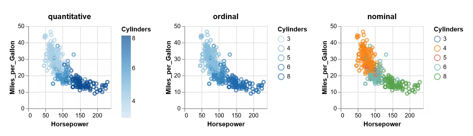
Color encoded as a datatype
Show/Hide Code plot-datatypes.py
import altair as alt
from vega_datasets import data
source = data.cars()
base = alt.Chart(source).mark_point().encode(
    x='Horsepower:Q',
      y='Miles_per_Gallon:Q',
   ).properties(
      width=140,
      height=140
   )
alt.hconcat(
      base.encode(color='Cylinders:Q').properties(title='quantitative'),
      base.encode(color='Cylinders:O').properties(title='ordinal'),
      base.encode(color='Cylinders:N').properties(title='nominal'),
   )

base.save('plot-datatypes.html')
Note
Data Types Affect AxisScales
The type used for the data will affect the scales used and the characteristics of the mark.
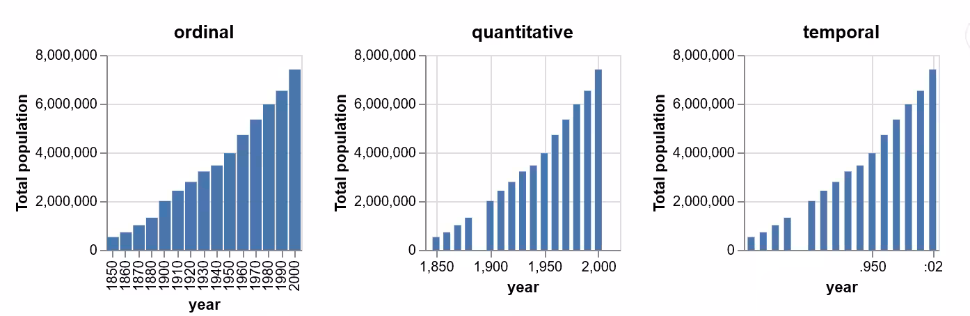
Missing data found on 2 datatypes, but the years require formatting
Show/Hide Code plot-datatypes01.py
import altair as alt
from vega_datasets import data
pop = data.population()

base = alt.Chart(pop).mark_bar().encode(
      alt.Y('mean(people):Q').title('Total population')
   ).properties(
      width=140,
      height=140
   )

alt.hconcat(
      base.encode(x='year:O').properties(title='ordinal'),
      base.encode(x='year:Q').properties(title='quantitative'),
      base.encode(x='year:T').properties(title='temporal')
   )

base.save('plot-datatypes01.html')
Because values on quantitative and temporal scales do not have an inherent width, the bars do not fill the entire space between the values. These scales clearly show the missing year of data that was not immediately apparent when we treated the years as ordinal data, but the axis formatting is undesirable in the other two cases.
To plot four digit integers as years with proper axis formatting, i.e. without thousands separator, convert the integers to strings first, and the specifying a temporal data type in Altair. While it is also possible to change the axis format with .axis(format='i'), it is preferred to specify the appropriate data type to Altair:
pop['year'] = pop['year'].astype(str)

base.mark_bar().encode(x='year:T').properties(title='temporal')
Hint
Working in Jupyter
As opposed to many Python GUIs the previous input stands, if the data source changes provided that the imports still stand:
import altair as alt
from vega_datasets import data
one can continue modifying the code without reimporting - but beware of side effects. If the name of the altair Chart is declared then ensure that this is not used for a different set of data.
Altair Tooltip#
Most popup/balloon cursors require special attention, especially when being customised. The plotting for water properties is usually made with the property versus temperature. Altair requires a list of the variables that will show in the cursor/tooltip so a standard tooltip will be part of the encode command:
.....
alt.Chart(source).mark_line().encode(
    x='Temperature °C',
    y='Ps bar',
    tooltip=['Temperature °C', 'Ps bar']
)
....
"Temperature °C" and "Ps bar" were the x and y lists, the tooltip will display the name of the variable, followed by a full colon then the value:
Temperature °C: 25
"Ps bar" would show a float number with a large number of decimal places. In order to format the value the original tooltip must have another formatted tooltip added to it:
.....
alt.Chart(source).mark_line().encode(
    x='Temperature °C',
    y='Ps bar',
    tooltip=['Temperature °C',  alt.Tooltip('Ps bar', format='.3f')]
)
....
If multiple variables are required to be displayed in a single line then use the transform_calculate function before calling the tooltip:
alt.Chart(stocks).mark_point().transform_calculate(
    combined_tooltip = "datum.price + ' ' + datum.symbol"
).encode(
    x='date',
    y='price',
    color='symbol',
    tooltip='combined_tooltip:N')
Here a point plot has been called and the result is declared as a nominal type.
Altair Title#
There seems to be two methods to apply a title, either create the title directly in Chart or add a properties function:
.....
chart_title = alt.TitleParams(
    "Saturation Pressure of Water")

alt.Chart(source, title=chart_title).mark_line().encode(
    x='Temperature °C',
    y='Ps bar',
    tooltip=['Temperature °C',  alt.Tooltip('Ps bar', format='.3f')]
)
....
or:
....
alt.Chart(source).mark_line().encode(
    x='Temperature °C',
    y='Ps bar',
    tooltip=['Temperature °C',  alt.Tooltip('Ps bar', format='.3f')]
).properties(
    title={
        "text": "Saturation Pressure of Water",
        "color": "red"
    }
)
....
Titles for Axes#
Each axis title can be created by using its final nomenclature as the name given in the source dictionary then used throughout the Chart buildup:
source = pd.DataFrame({
    'Temperature °C': T,
    'Ps bar': pc
})
Most of the code snippets above use this method.
If the full axis name is too cumbersome use a descriptive short form, then explicitly change the title within the encode function:
....
source = pd.DataFrame({
    'T': T,
    'ps': ps
})

alt.Chart(source).mark_line().encode(
    x=alt.X('T', axis=alt.Axis(title='Temperature °C')),
    y=alt.Y('ps', axis=alt.Axis(title='Density kg/m³')
)
....
It is safer to explicitly give the axes a handle, especially when only changing the y axis.
Axis Limits#
The axis limits start at 0 by default, this worked well for the saturated pressure, but for the density this shows a plot that is almost horizontal at 1000 kg/m³. If we limit the temperature to 0-30°C then set the y axis limits between 995 to 1000 kg/m³:
....
alt.Chart(source).mark_line().encode(
    x='Temperature °C',
    y=alt.Y('Density kg/m³', scale=alt.Scale(domain=(995, 1000))
    )
....
This can be combined with the full labels of the axes:
....
alt.Chart(source).mark_line().encode(
x=alt.X('T', axis=alt.Axis(title='Temperature °C')),
y=alt.Y('ps',
    scale=alt.Scale(domain=(995, 1000)),
    axis=alt.Axis(title='Density kg/m³')
    ),
tooltip=['T', alt.Tooltip('ps', format='.3f')]
....